Gene Expression Bar Plots
A simple and intuitive module for visualizing gene or transcript-level expression across samples. This tool helps researchers quickly compare expression patterns, verify sample grouping, and identify differences between experimental conditions. The plots are generated directly from uploaded count or TPM/FPKM matrices, allowing users to explore raw or normalized expression values.
Step 1: Select Expression Type
Choose whether the plot displays gene-level or transcript-level expression.
You can toggle between the two modes and select one or more identifiers from the search bar.
Options
- Gene Data – Displays expression values for genes.
- Transcript Data – Displays expression values for transcript isoforms.
Features
- Auto-complete search
- Multiple selection
Expression type selection area
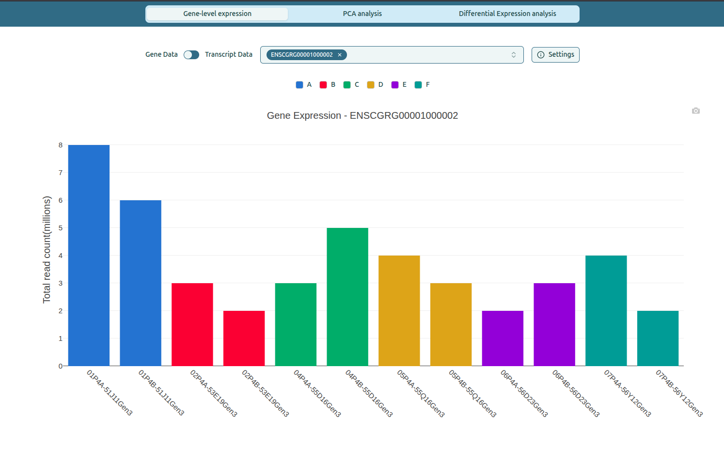
Step 2: View Single or Multiple Bar Plots
The page updates automatically when identifiers are selected.
Single-gene view
- Shows one large bar plot for the selected gene or transcript.
- Each bar represents the expression value for a specific sample.
- Bar colors correspond to group assignments chosen during the sample–group mapping step.
What the colors signify
- Each color represents one experimental group (e.g., A, B, C, D, E, F).
- Samples belonging to the same group appear with the same color in the plot.
Single-gene expression plot
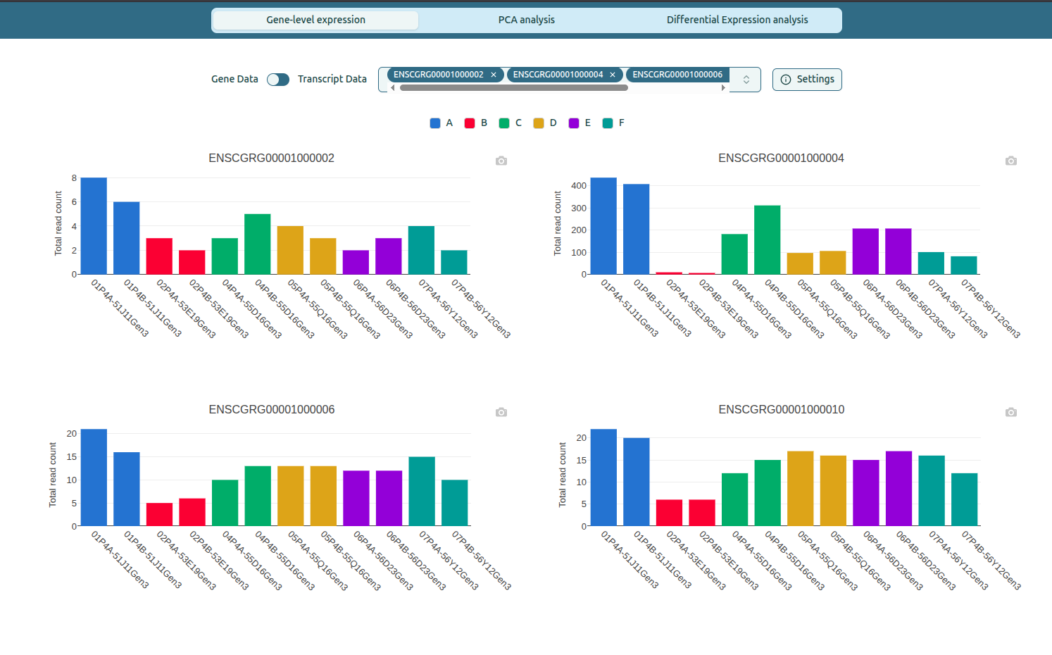
Multi-gene view
- Up to four bar plots appear at once.
- Each plot has its own label and color legend.
Features
- Consistent color mapping across genes.
- Automatic scaling for clarity.
Multiple gene expression plots
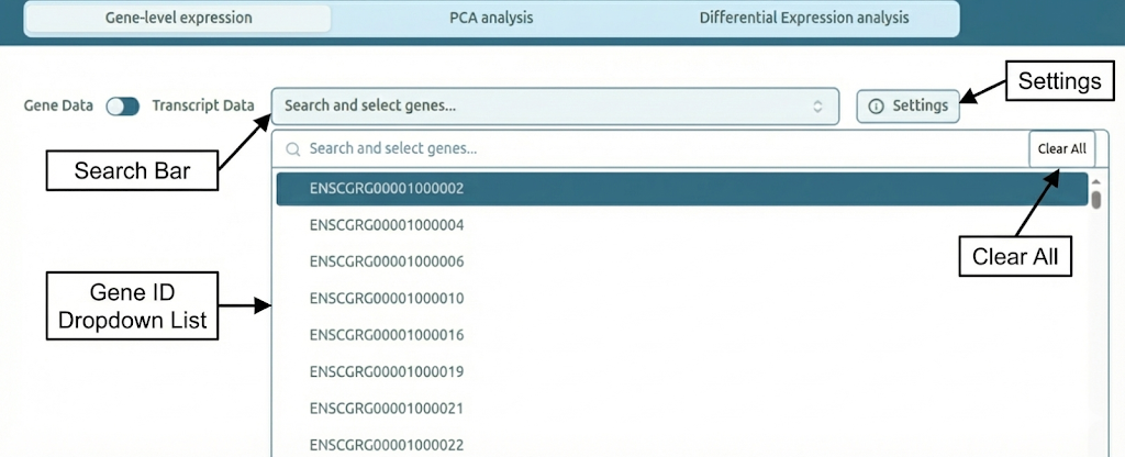
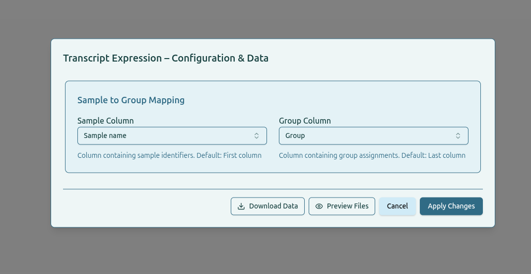
Step 3: Configure Sample and Group Columns
The Settings panel allows users to specify how samples are linked to their group assignments. This ensures that bar plots display the correct group colors and labels.
What you can configure
-
Sample Column
Column containing sample identifiers. This value is used to match expression data with metadata. -
Group Column
Column containing group assignments such as treatment conditions or experimental groups.
How to use
- Click
Settingsto open the configuration panel. - Select the appropriate column names from the dropdowns.
- Click
Apply Changesto update the plots.
Additional options
Download Data– Download the input files used for gene or transcript expression.Preview Files– View the contents of the selected data files before applying changes.
Settings panel for column selection
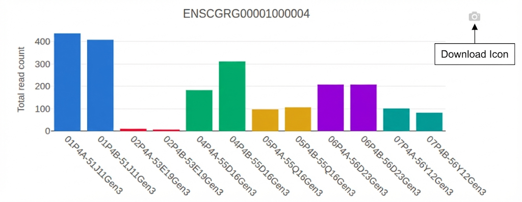
Step 4: Download Plots
Each plot includes a download icon for exporting images.
How to download
- Click the camera icon on the top-right corner of a plot.
- Select Download plot as PNG.
Output
- High-resolution PNG image.
- Suitable for publication, presentation, or reports.
Download plot example